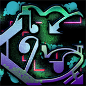
Though I don’t paint graffiti myself, I’ve been known to doodle pieces in in my art books and school notebooks. While I enjoy working with physical mediums, my skills are definitely sharper in the digital realm. The other day I felt like doodling in Photoshop and came up with an idea to play with typography. I wanted to make a graffiti piece based after the fonts on my computer. What you see here is 100% hand-drawn using my wacom tablet, but I’ll explain the steps I took to arrive at this final piece. Note, this is not a tutorial, but it’s detailed enough to inspire any mid-level / advanced shopper.
(Click image for full size)
If you can’t tell, it says my name, GREG. While it may seem like madness, here’s the steps I took to make it. First I got a large bold font to draw upon:
 Then I filled in each letter, one by one, with interesting patterns. My goal here was to balance and mix straight edges and hard corners with elegant curves and flairs.
Note that, in the above image the fills weren’t particularly pre-determined. I just started in one corner of each letter, and went with the flow. I “felt” how each line should proceed, and when it was getting monotonous and time to switch it up. Next I connected the letters where it seemed most logical. I didn’t plan on them being this easy to connect, it just sorta happened that way:
I wanted my piece to have multiple layers to add visual interest. I repeated the process using a different font and theme. This time I chose a looser, but still bold font to fill. I just used a hard paintbrush to fill bubbles in the corners of the letters where it seemed logical. I like making rules and following them – sometimes it forces you to be creative, but other times like this it helps to add rhythm to the piece.
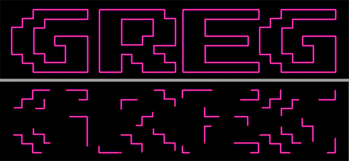
I needed more layers still, so this time I took a retro-pixel font and selectively deleted some of the edges. I never wanted any of the layers to completely make the letters obvious, but I wanted them to strongly imply the letters gestalt.
Still not satisfied I picked yet another font and distorted it a bit. I warped it randomly with the liquefy tool and then made it speckly with some noise shader.
The next part is too detailed to explain fully, and to be honest, I was already playing with the final mix as the other layers were being made. Basically I applied special effects to the layers, and balanced the best way to blend them. It’s interesting – at this point it was almost like mixing music. There were different colors (which I couple swap out at any time) but also different textures, values, saturations and spaces. Much like an audio mix, my goal was to give everything room to shine without over powering the whole piece. Overall I’m really happy with the mix, and the final piece..
Oh and if you’re wondering about the title – it’s not a typo. I learned on reddit the other day that graffito is actually the singular form of graffiti, which is plural. So since this is a single piece of “digital graffiti” it’s more proper to say “digital graffito.” The more you know!
February 2, 2015 at 11:07 am | Art


